Nothing deters internet searchers more than a sloppy, disorganized website. Your landing page is literally your welcome sign to the virtual world, and if it is a shamble of information overload, most visitor will likely pass it over in search of more concise, easy to read sites. In order to create a homepage that is inviting and visually appealing, as well as informative, can be a daunting task, but if managed correctly, can do wonders for your online presence. Here are a few tips in creating a homepage that says everything you need it to, without out overwhelming your audience.
The Whipp Blog
Tags: Web Content, design, blog, landing page, Get found, Whipp, content, online
What is an admissions marketing content strategy?
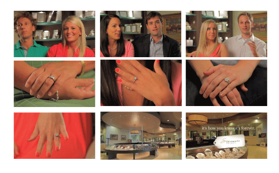
In this town, if you're looking for an engagement ring somewhere in the, let's say, $60,000 range, you go to Smithworks. Lewis Smith is pillar of the community, trusted for generations, and a favorite in the zip codes where zip codes mean something. But Lewis wasn't ringing bells in the young-love-first-marriage demo as much as he would like to (second, third, and fourth marriages were still strong) so he asked Whipp to help position him as the premier engagement ring retailer among the town's A-list under 30 set.
Tags: design, Smithworks TV Spots, Whipp commercials, Smithworks and Whipp, Whipp, Smithworks, Whipp Spotlight, Whipp and Smithworks, online, Commercials
Rug&Home is a five-state home furnishings empire boasting hundreds upon hundreds of thousands of rugs, luxury furniture items, accessories, art, and decor.
Its reputation for high-end merchandise at rock bottom prices paired perfectly with its respected clientele ranging from Billy Graham and Gladys Knight to the Biltmore Estate and Hollywood movie sets (George Clooney HIMSELF has enjoyed the luxury of a Rug&Home rug).
But above and beyond anything else, they were best known for an iconic high-pitched, backward-walking blonde in a series of low budget commercials that were as much loathed as they were loved by viewers armed with mute buttons from Tennessee to Georgia and all points in between.
To make matters worse, test after test revealed that audiences thought Rug&Home only sold rugs, even though every one of their stores featured thousands of square feet of furniture and accessories.
So when their sweet young bombshell turned baby mama, Rug&Home turned to us to create something fresh and new that would signal a change without losing the fun, while elevating the brand and showcasing their variety beyond just rugs.
Derek had just recently been introduced to a brother-sister team of filmmakers from Hendersonville (who later moved to Hollywood and have just wrapped working on the Betty White Show) and Chris started stalking them on Facebook. After a few "brainstorming" sessions at Limeleaf Chris and Derek came up with the perfect plan to capitalize on the young artists' talents and sweep in a new era of commercial style for Rug&Home.
Challenge One: Turn down the volume without being boring
Challenge Two: Showcase the variety
Challenge Three: Elevate the brand and give it a personality
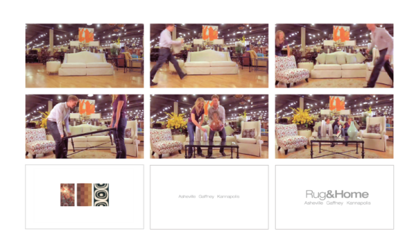
To contrast the chains previous vocal spokesgirl, the campaign featured a series of silent movies. Three styles of music were chosen to reflect three kinds of audiences (a happy and poppy charmer, a dramatic vaudeville jaunt, and a fashionista disco funk) and an animated tag was designed to highlight rugs along with the chain's three main locations and online store. The short silent films followed the antics of the brothers and sister through vignettes that showcased the entire scope of all the stores had to offer by allowing them to build entire rooms from start to finish and playfully interact with merchandise in a variety of styles.
We launched the campaign during the Super Bowl to huge success. And the purely visual approach proved to be just as effective if the viewer happened to be muting or fast forwarding as it was in real time. Responses from customers even indicated that they were so intrigued by the scenes that they tended to stop, rewind, and watch the commercials again whenever they spotted them.
Tags: creative firms, design, style, Whipp, Rug&Home, Whipp guide, Whipp and Rug&Home
Did social media take off and break the blogger hearts? Have Facebook, Twitter, Pinterest, LinkedIn, Google+, and all the other social networks done to blogging what video did to radio? Remember the lyrics? “Video killed the radio star.” Have blogger voices and careers been cut short by social media buzz? Is the era of blogging about to pass? We don’t think so. In-fact, we think the opposite.
Tags: Internet, design, wordpress, online marketing, blog, Whipp, google, online, viral
How does one become a Rhodes Scholar? Well, you become a Whipp intern first. Obvi.
Tags: design, blog, Whipp, Rachel Woodlee, content, Rhodes Scholarship
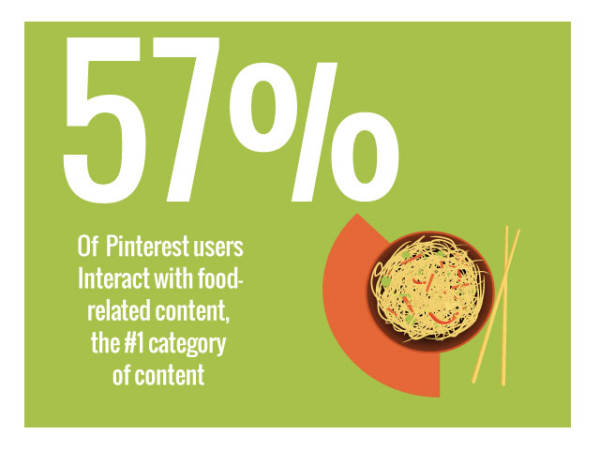
Tags: creative firms, design, vintage, style, Whipp, marketing, content, Pinterest facts, online, viral, inbound marketing
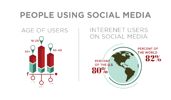
Should your company be using social media? We all need it, and it’s constantly changing at hyper speeds. Before your company decides to kick social media out the door, here are a few statistics:
Tags: SEO, design, style, Social Media Explained by Whipp, Whipp, marketing, content, online, lead generation, inbound marketing, Whipp guide
1: Wofford. Ok, we may be slightly biased…We did design this one. But it speaks for itself. It is a beautiful site, easy to navigate and easy on the eyes. It’s an all around goody bag of worthy design technique to model after:
Tags: design, vintage, style, Whipp, top 10 college websites, content, inbound marketing, Whipp guide, Whipp’s top 10 college websites
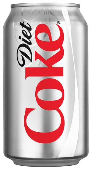
Ralph and Chris, Whipp partners, first began using Diet Coke when they took the Pepsi challenge in 1994 and Coke won. They desperately wanted to get out, but as the rewards points piled up the cost of quitting outweighed the benefit. They are most recently hoping to win a 60’’ plasma HDTV and a pair of Beats headphones. Coke caps, reward prizes, and bottles have begun to fill their offices, and hoarding has become an issue. As the Whipp partners have begun to realize they have a problem, they decided to start their very own, Diet Coke anonymous club.
Tags: design, style, AA, Whipp, google, marketing, online, inbound marketing, Diet Coke Anonymous, Diet Coke


