Content is the most important aspect of a website. Without it, your site would be like a TV channel with no shows. An Italian restaurant with no pasta. People Magazine with no Kardashians. You’ve got the outlet, but are you getting the message through?
Many digital writers still write using the methods from traditional print publications, but as the Internet and web content changes and adapts to serve its purpose, the style and techniques change as well. While things like full justified paragraphs and lengthy sentences may be great for the look and read of a paperback, they are not meant for the screen.
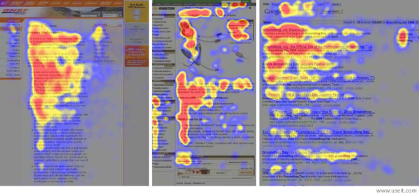
In a study by the Nielson Norman Group, they recorded how over 200 participants viewed thousands of web pages. They found that the behavior of the users’ reading patterns was consistent across different sites, and resembled an “F” pattern.

(image source: useit.com)
The “F” pattern is reflective on certain elements that seemed to be common among most web viewers and can be broken into three elements:
1. Reading across the top horizontally
The viewer usually reads across the top part of the content area first. This is why it is important to always frontload your content. This means to start paragraphs, headlines and links with significant phrases or words that will communicate the content to follow in that paragraph or sentence. This grabs readers’ attention and makes sure the important content is easily found by the viewers wandering eyes looking for a place to land on the page. These hooks should be visible immediately when your viewer lands on the page so that they can easily find what content they are interested in without searching or scrolling.
2. Dropping below a break and reading across horizontally
Most people don’t read every word of an article, or most words for that matter. So the viewer usually will find what they want in the first big block of content, skip the rest and move to the next, usually shorter content area. This is why many people create breaks in their articles with separate paragraphs to keep the different thoughts separate. It is important to start blocks of content with important and meaningful words so that the reader can scan the separated content blocks to find what they want.
3. Scanning the left side vertically
In the Nielsen Norman Group’s study, the eyetracking heatmap shows that the viewers usually scan the left justified content of the page last, sometimes slowly and sometimes quickly. After the first two blocks of content grabbed the readers’ attention, they skim the rest of the text in the left hand margin area. This means that you should make it easy for the viewer to read the second half of an article by presenting important aspects of the articles such as links, keywords or lists aligned to the left.
Now that you have the useful knowledge about how users view and read your content, go give your articles an F and get your important content out there for your readers to enjoy!

___________________________________________
Excuse us for not interrupting. We create content for today’s audience-controlled mediaverse. We don’t shout above the noise. We bring the conversation in close. And we keep it real. You are exactly what your prospects have been looking for. Maybe they just don’t know it yet. We can turn you into their hero. Let us create an image and a message that resonates with people looking for someone that speaks their language. We're Whipp.
